Birth Control Education
Objective:
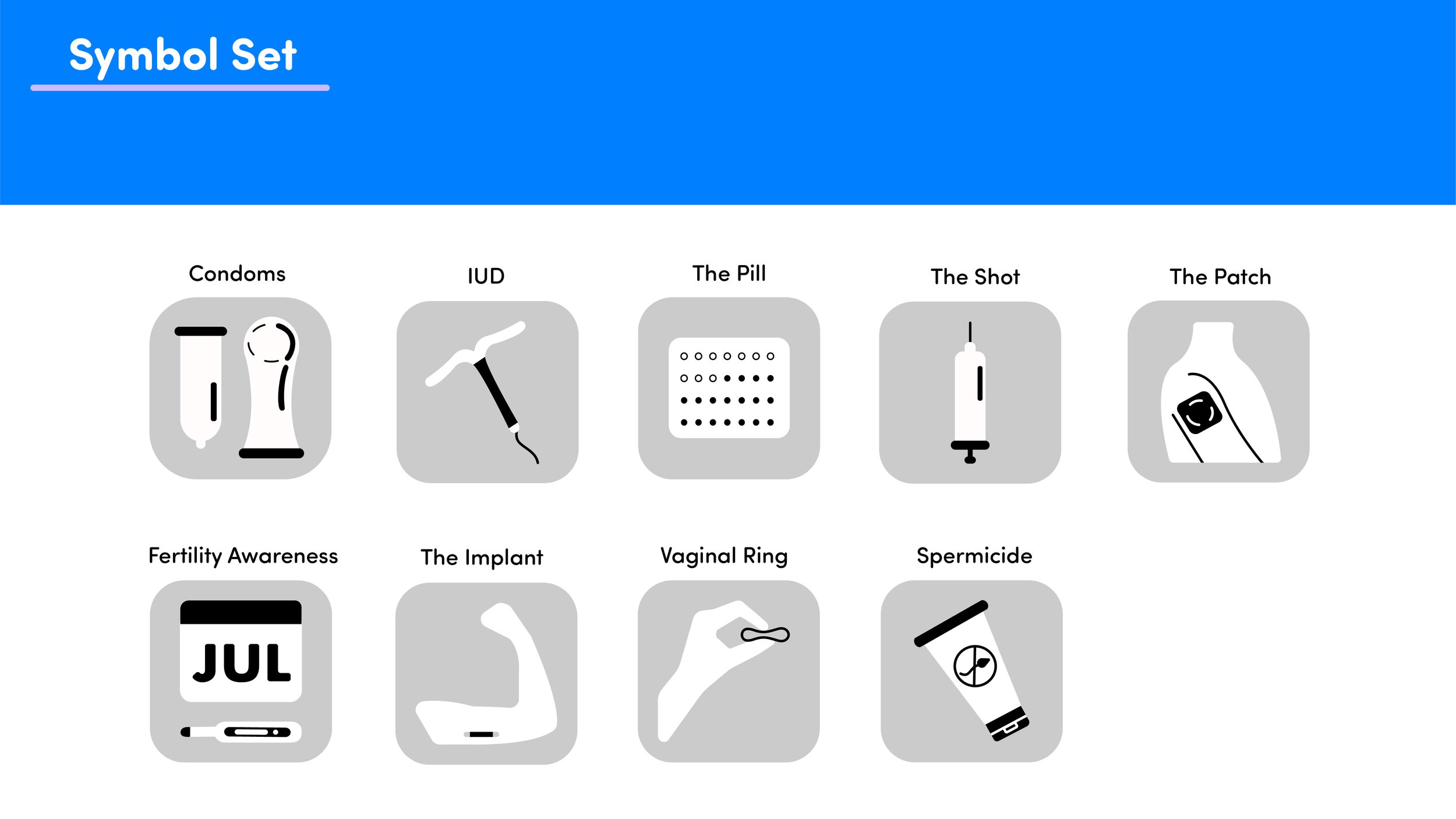
Design a series of nine icons for The Health Collaborative's collaboration with Planned Parenthood for a symbols for awareness on birth control methods.
Conceptual Work
Concept:
An informational pamphlet to be easily distributed and understood by high school students.
Approach:
Flat design, simple shapes, and bright colors were used to make the icons attractive towards teenagers as well as making the icons easily identifiable.


Phase 1: Research and Inspiration


Initial Sketches


Phase 2: Experimenting with Form
Phase 3: Finding the Style
Phase 4: Adding Depth


The final aesthetic for the icons is a simple, flat, rounded design. The icons have a calming and friendly appearance to them to seem more attractive towards their younger audience. They were kept fairly simple so they could be easily identifiable and rememberable as well.
Phase 5: Finding the Geometry


Phase 6: Final Iterations and Scale Test
Color Iterations


On the right is the final version of the front and back of the pamphlet that would be handed out in schools. The blue, white, and purple were chosen to make the pamphlet bright and fun while also having a sense of clam with the cooler tones. The high contrast between each color increases the legibility as well.
Application
Final Client Presentation